Government of Ras Al Khaimah
How we rebuilt the brand of an entire emirate.
- Role
- Senior Product Designer
- Team
- 3 designers
- Product Owner
- 3 developers
- My contribution
- Concept direction
- Interaction design
- Design system
- Interface design
- Timeline
- 3 months
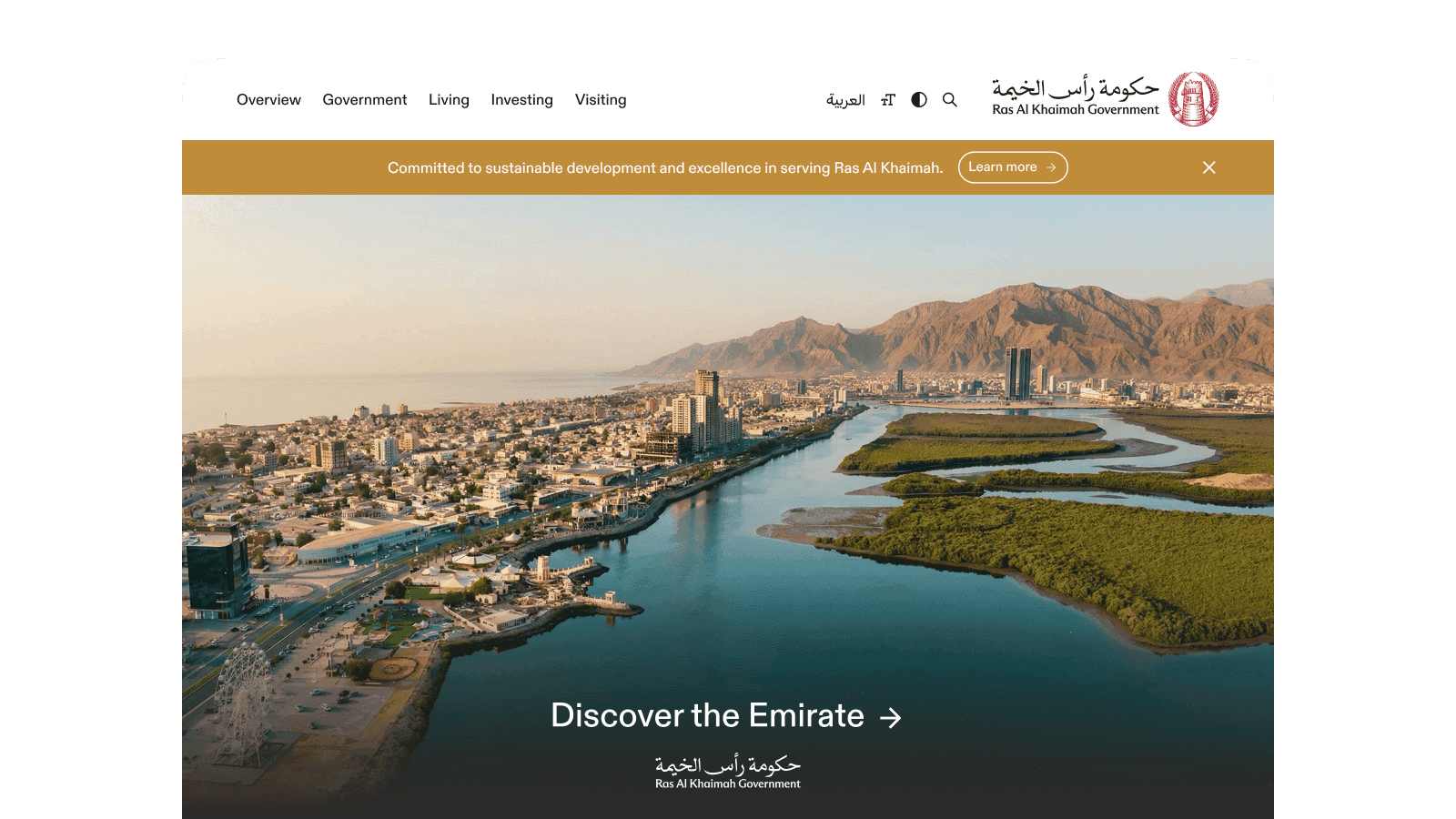
rak.ae is the Government of Ras Al Khaimah’s main website, serving around 200,000 monthly users. It brings together information for residents, businesses and tourists, but its legacy interface did not provide a shared digital language for departmental websites.
- Goal
- Turn a legacy government portal into one digital brand and a component system.
- My role
- I focused on the site architecture, design system and DX for the client team.
Audience
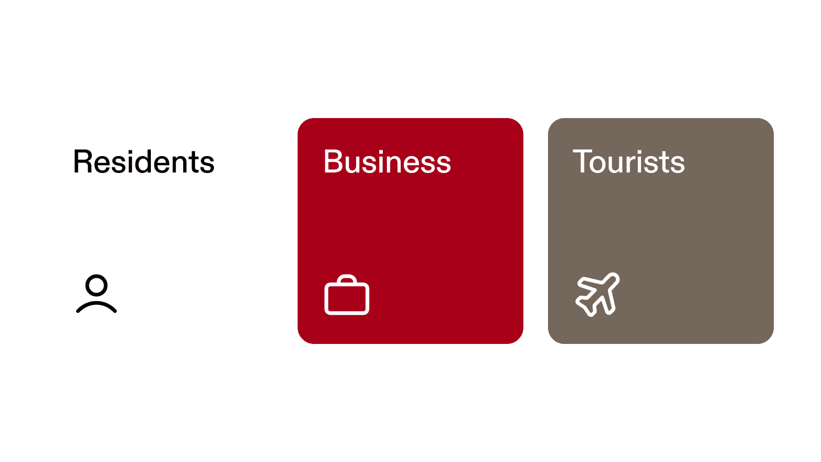
The portal serves residents, businesses and tourists. Their reasons for visiting differ, but every government website needed to read as one government, with a consistent visual language, navigation and tone of voice.
Brand
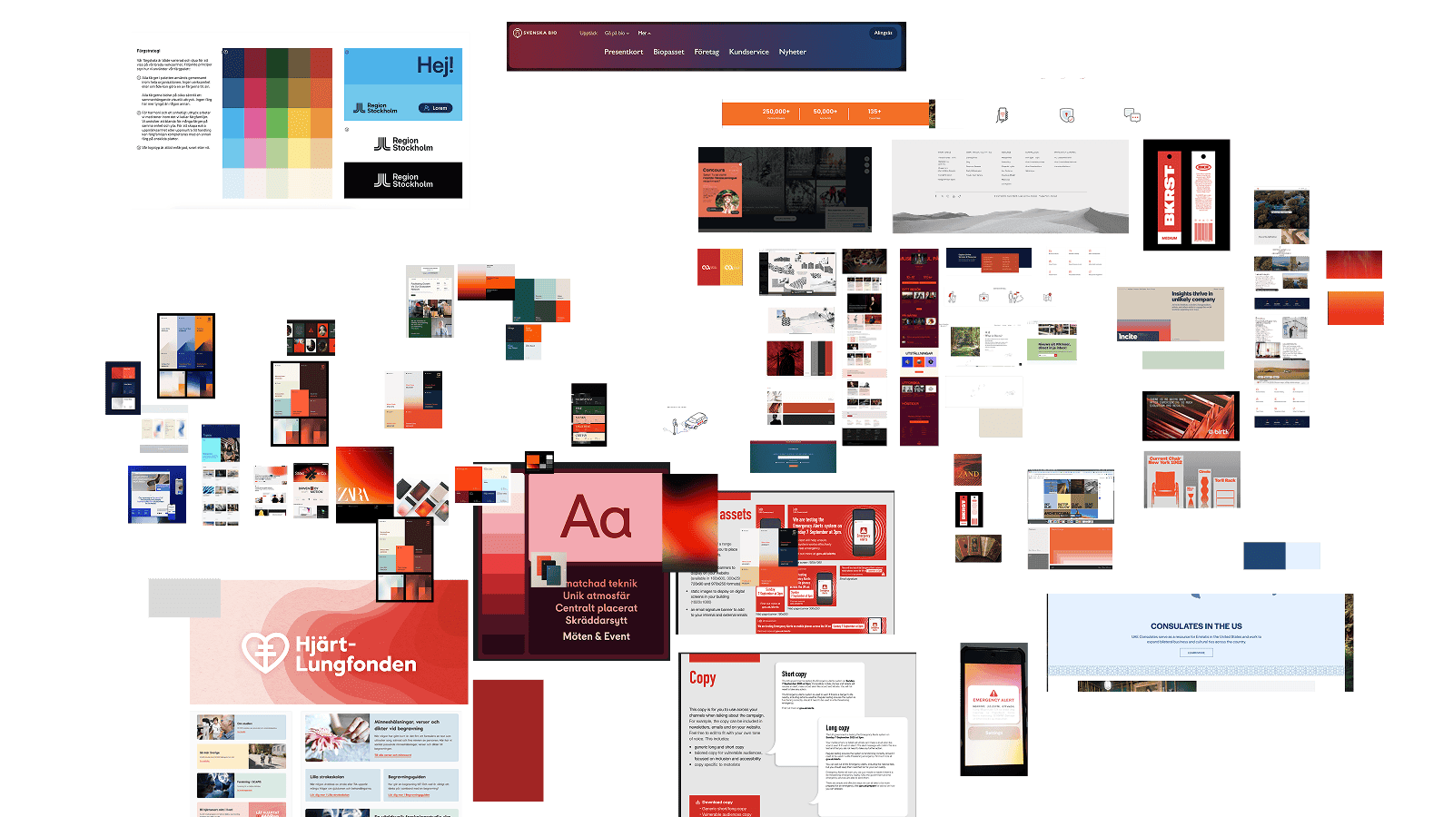
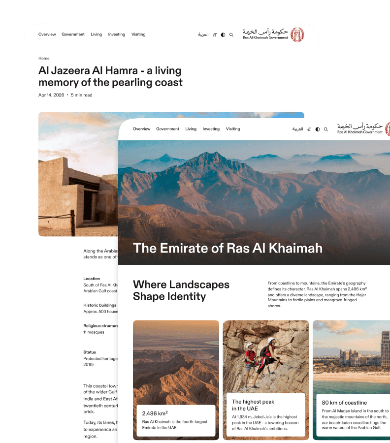
We began with a moodboard and several directions for the website and identity. Through a few iterations, we defined the image of a confident emirate moving forward while remaining connected to its history and principles. The visual language also drew from the landscape of the UAE’s northernmost emirate. We retained the logo but reworked the typography, colour, graphics, photography and tone of voice.
Design in code
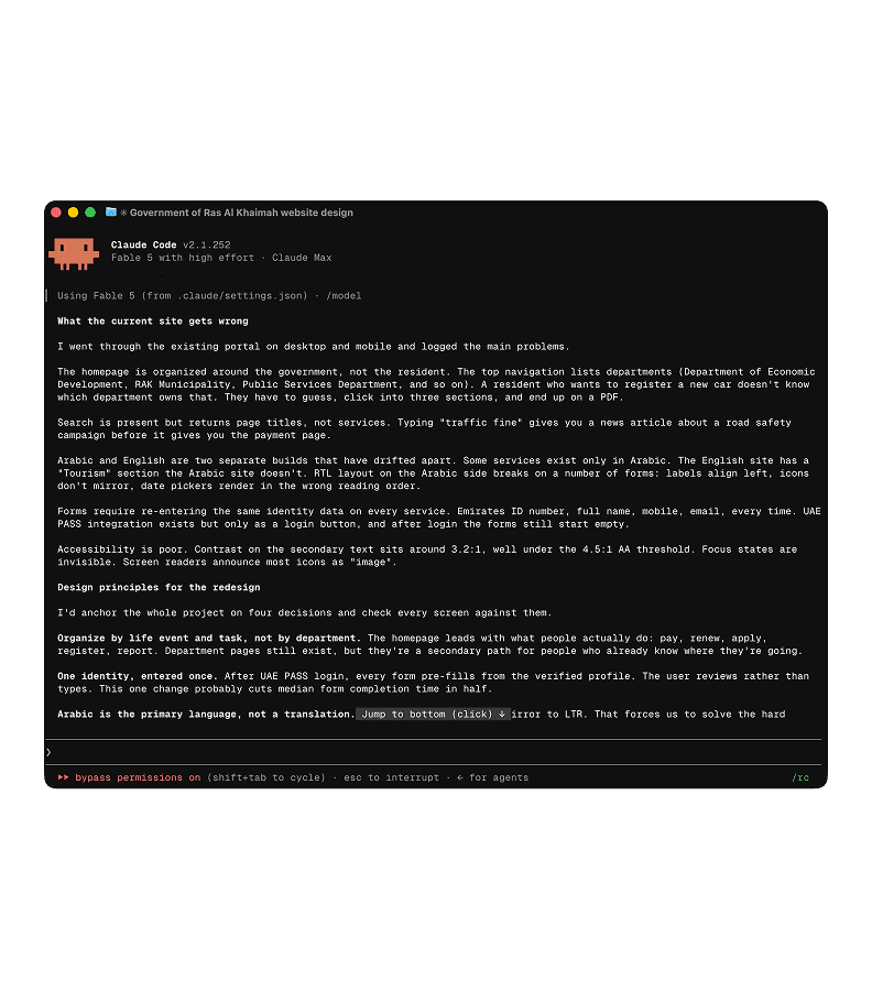
Rather than creating a separate prototype, we designed pages in Figma and built them with Claude Code at the same time. As the page concepts developed, we established the front-end foundations and moved completed design-system components directly from Figma into code.
Grids
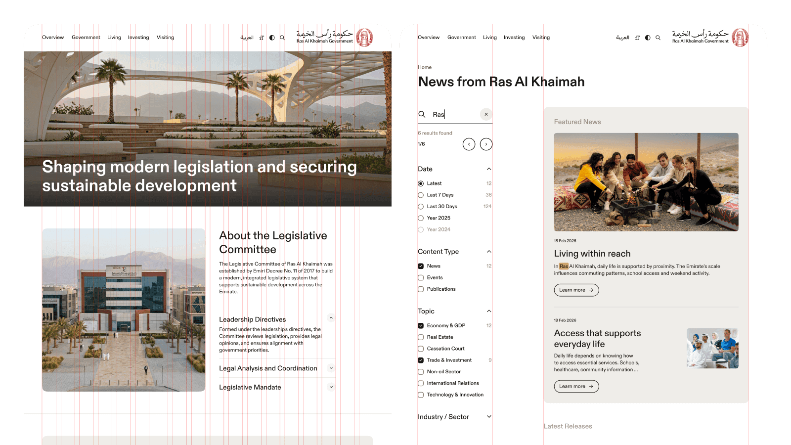
The final design used two grid systems. A conventional 12-column grid covered the main pages. The second layout shifted the visual weight to one side: its narrower left column held search and filters on split-content pages, or chapter navigation in long-form articles.
Arabic version
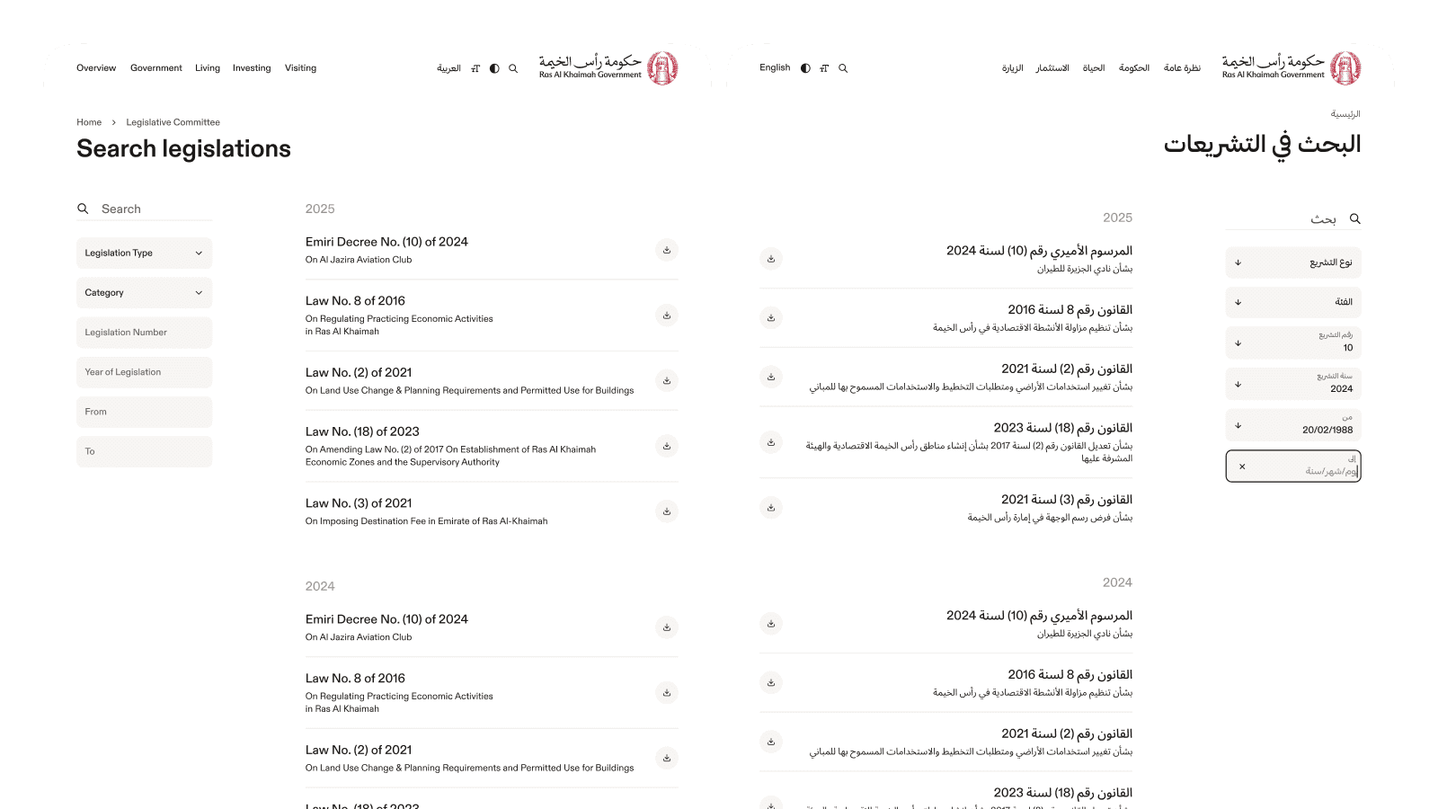
Once the core pages were approved, we adapted the system for Arabic and RTL. We adjusted the grids and components so Arabic pages could be built from the same blocks.
Design system
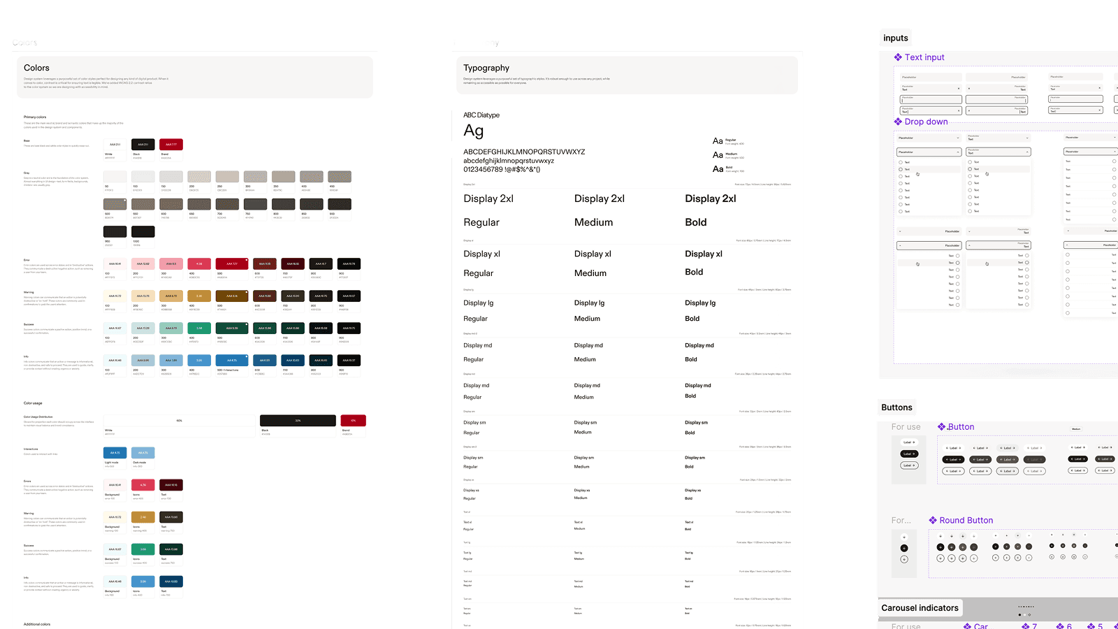
We maintained the same components and rules in Figma and in the working front end. Both sides assembled pages from the same blocks, so the built interface matched the designs without a separate interpretation step during development.
Page builder
We turned the design system into an internal page builder. The client team can use the existing blocks to create new portal pages and departmental websites while preserving the shared visual language, without designing and developing every template from scratch.
Handoff
We handed over the front end, page builder, design system, brand guidelines and supporting materials. The client got a working product, not a concept deck.
Outcome
The combined Figma-and-code workflow cut the time from a task to a production-ready page by 2.5x. The full system has been handed over to the client, with the public launch of the new portal planned by the end of 2026.